Making Slides with Quarto
Data Lab
Using Fragment with anything
You can use fragment to delay anything showing, including images, text, formulas, code, plots, etc.

4 images using layout-ncol
This is the main slide, with some desription of events
This is the main slide, with some desription of events
4 images using 4 columns
This is the main slide, with some desription of events
This is the main slide, with some desription of events
3 images using layout-ncol
This is the main slide, with some desription of events
3 images using 3 columns
This is the main slide, with some desription of events
Image Grid–use layout-col=


Image Grid - using columns
Image Grid–use layout-col=

agenda, learning outocmes/objectives
- Describe the forecasting workflow
- Identify factors affecting forecastability
- Describe forecasting methods
- Fit forecasting models using fable
- Produce forecasts using fable
- Evaluate forecast accuracy and residual diagnostics
- Visualise forecast distributions
image right
- Understanding UI components of Positron
- Create projects in Positron
- Describe three main tasks in data analytics using R/Python and how to perform them
- Describe three important things to know about R/Python
- Install and load packages
My first independent ersearch
How temporal aggregation (both overlapping and on-overlapping) affects forecasting accuracy considering autocorrelated series with limited length.


Code folded
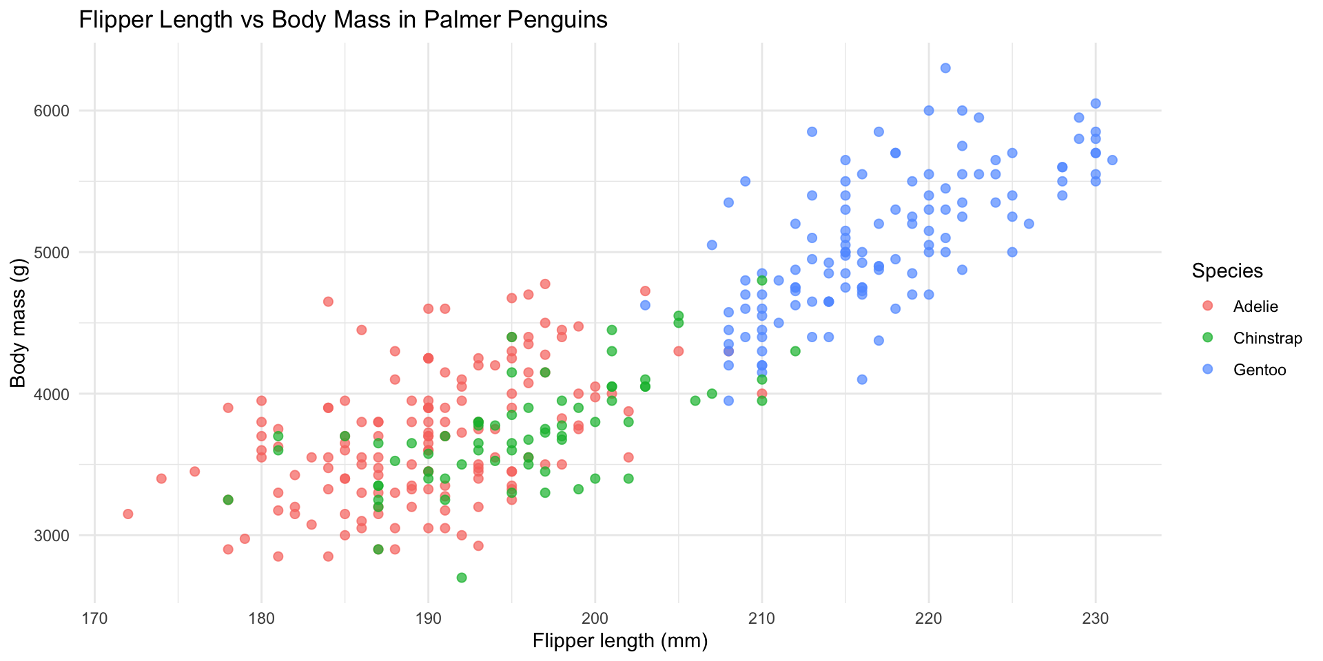
Figure 1
column
column-fragment

slide

fragment

default

Notes with code output
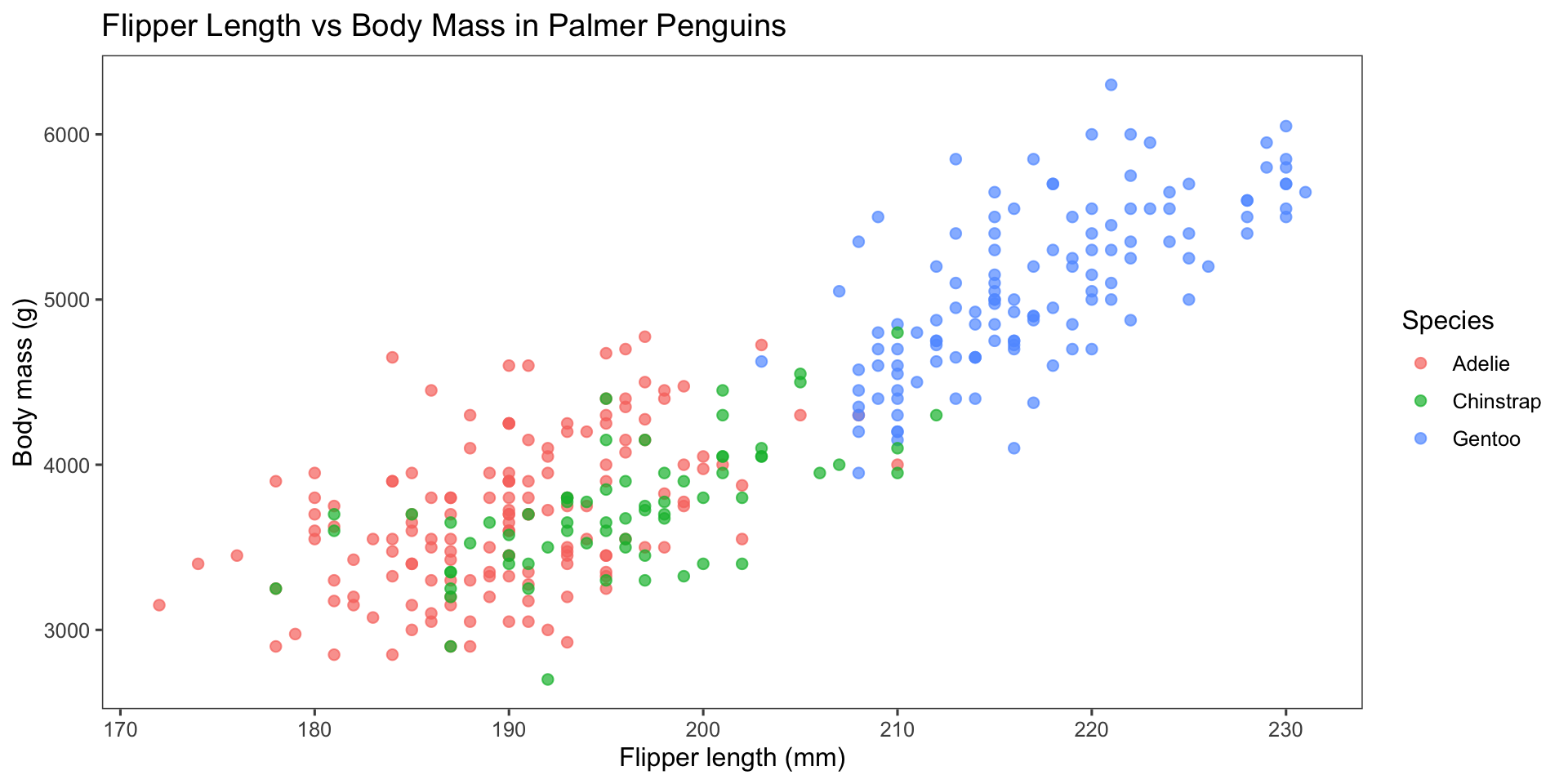
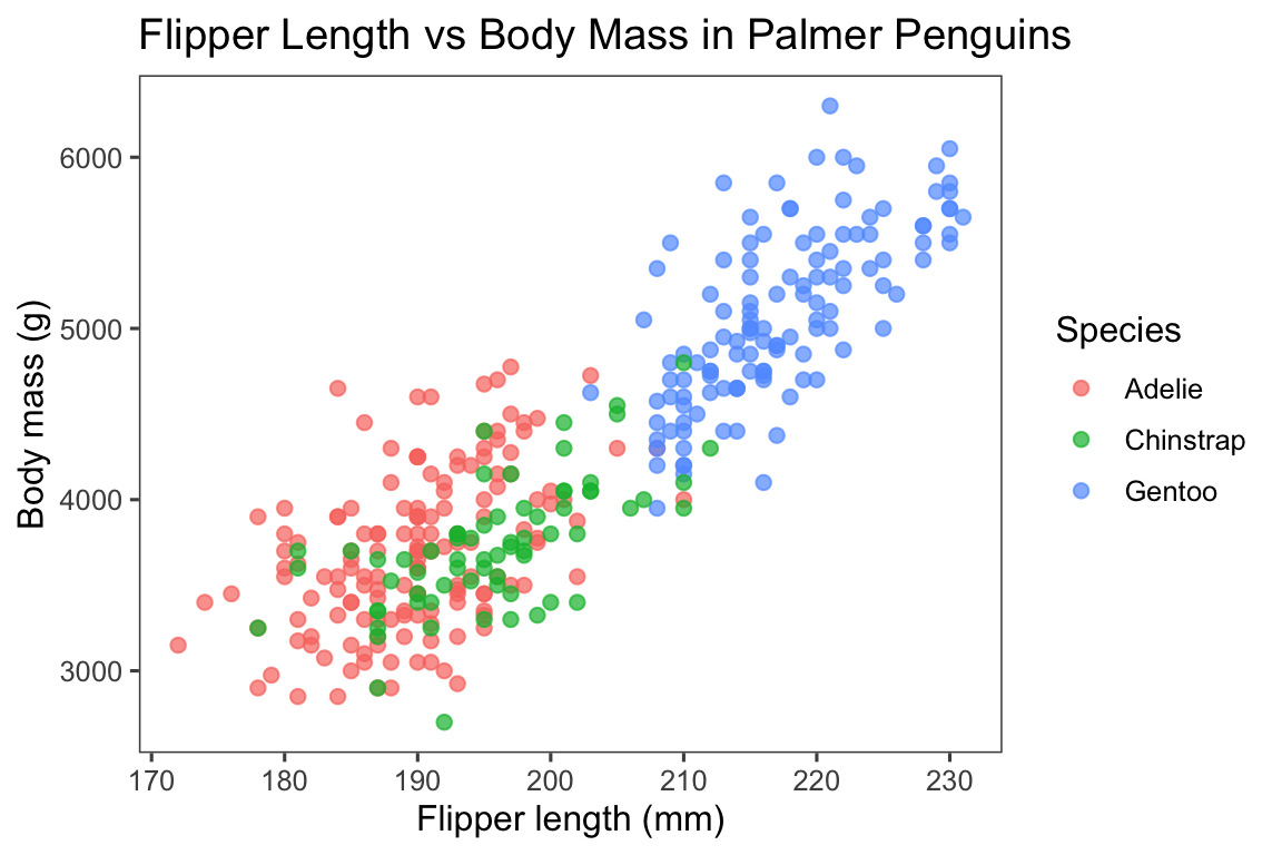
Meanwhile, Allison keeps playing with the penguins
And plotting with the penguins
And looking at more penguin pictures
Aligns eerily well with iris data
Panels and tabsets

Your Turn!
In small groups, discuss what is good about this chart.
What is bad about it?
Put content in middle and center
Birth of two ideas: Democratising Forecasting and Forecasting for Social Good


Any questions or comments? 💬

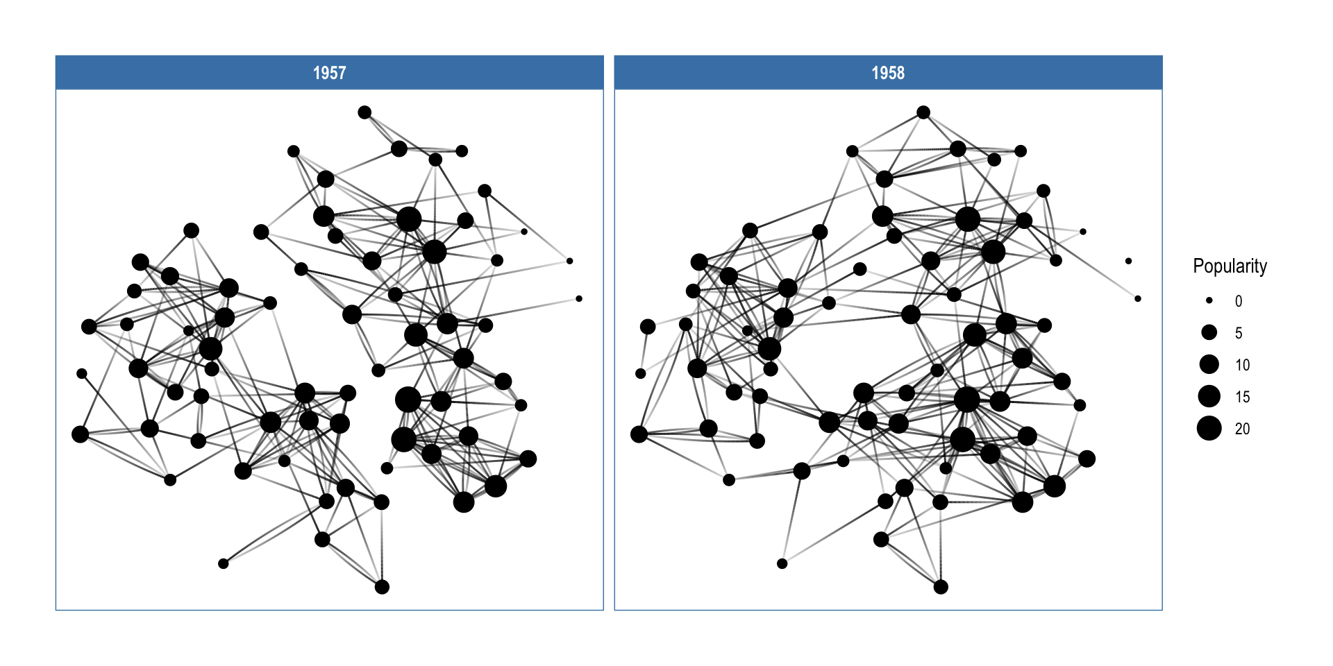
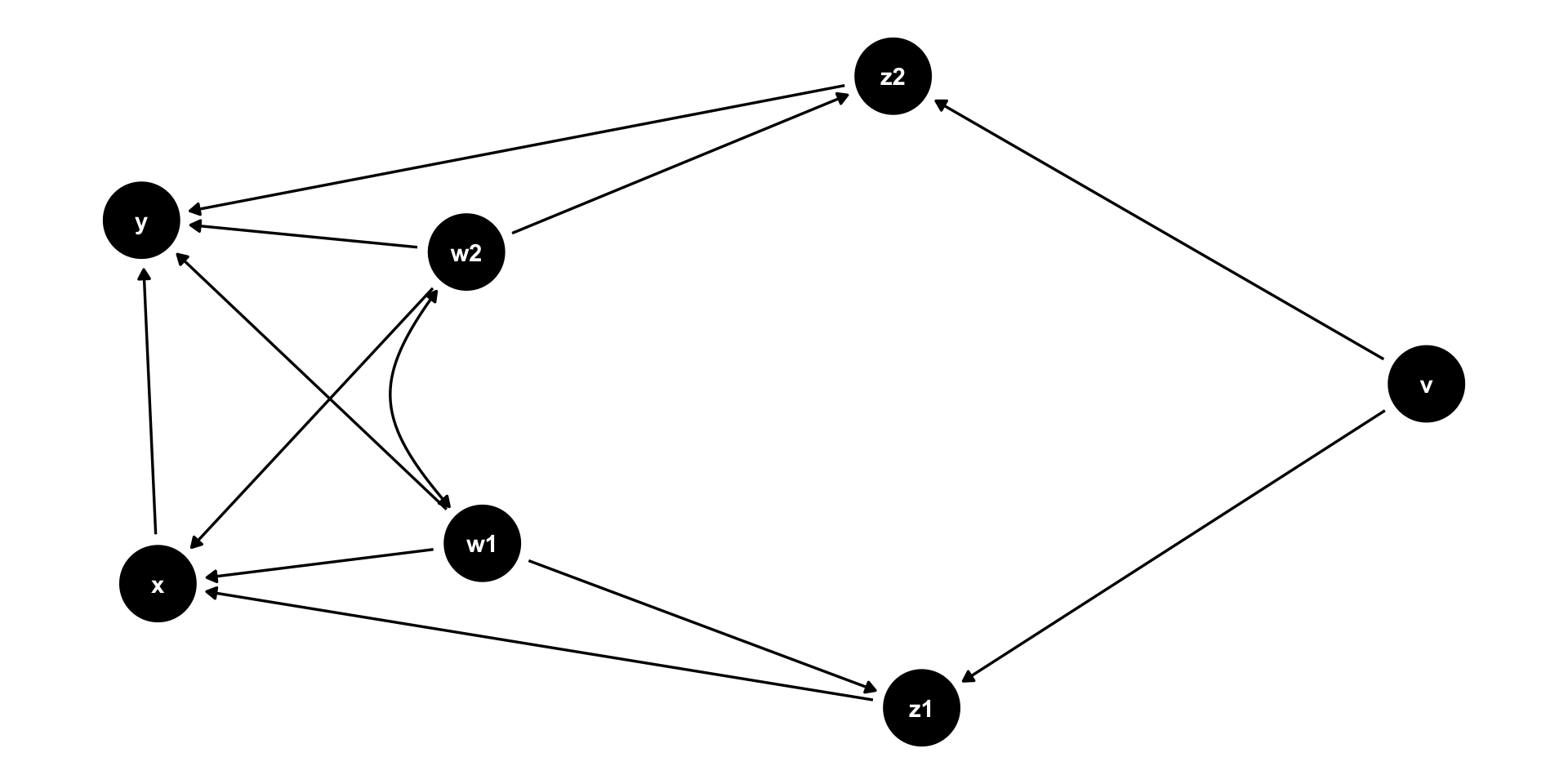
causal directed acyclic graphs
Use ggraph