Making slides & delivery tips for scientific presentations
PhD foundation, January 13, 2026, Cardiff

Agenda
Design philosophy for scientific slides
Visual and typographic principles
Technical and practical safeguards
Delivery skills
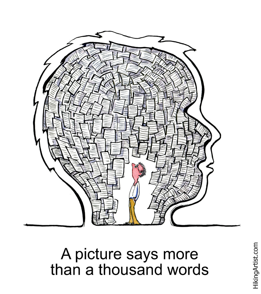
Visuals Over Text
Hierarchy of Understanding: Figures are easier to understand than words; words are easier to understand than equations.
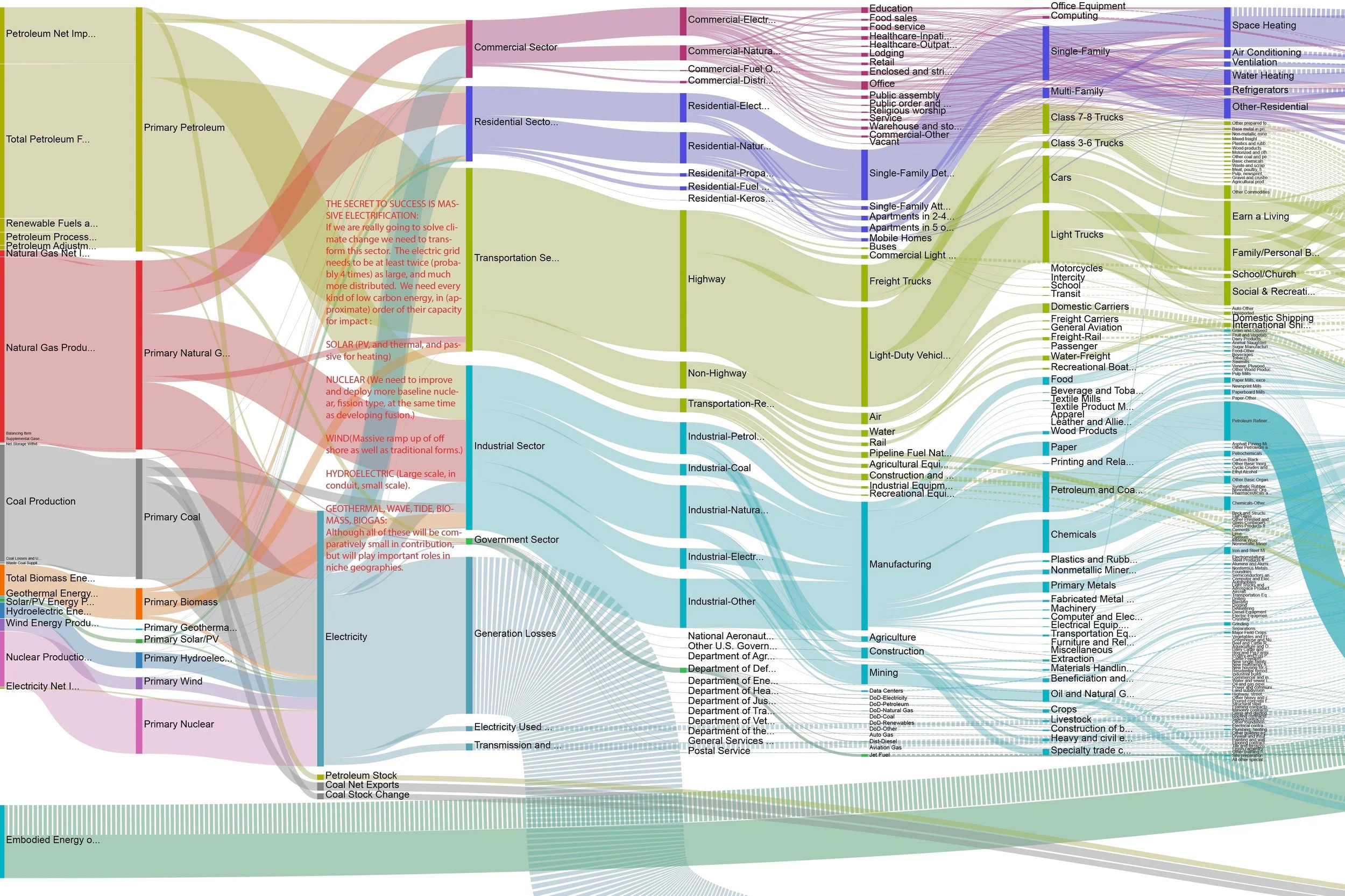
Graphics: Never have a slide that is only text. Build slides around visualizations.
Show, Don’t Just Tell: Use visuals and examples to illustrate points rather than just describing them
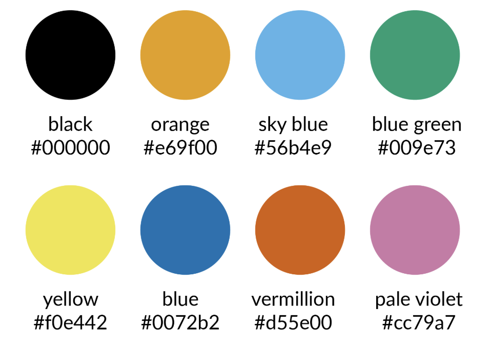
Font Color
- Use BlaCK or Dark Gray for text on light backgrounds.
- Use White or Light Gray for text on dark backgrounds.
- Limit Palette: Use 2–4 main colors.
- Accessibility: Use color-blind friendly palettes.
Visualiziations
High Quality: Use sharp, high-resolution graphics.
Readability: Ensure text in figures is legible, if you say sorry for it, it’s too small, then question why you included it.